Look & Feel

Anyone know if, on mobile, there is still a way to get to the home screen with one click? Used to be able to do it by clicking on the XenForo logo at the top, but now there's nothing in that space.

On mine I can click where the XenForo USED to be and it still works ... To the right of the hamburger button
 
Feedback time.

Great job, though! This is just the designer in me that can't help but over-analyze the aesthetic aspects of everything, so don't mind me too much.

Glad @agutierrezb started it, now the designer in me feel like less of an asshole for my own feedback.

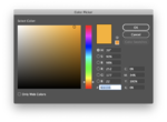
I would echo most of your points I think this is a great move forward, but the yellow color may be a bit overused. That said with these kind of sites which are essentially site builders you are often tied into these colors for all CTA / actionable items. I've run into this issue before with template based sites and it's always hard to adjust for. I think the warm yellow y'all are using is the one I suggested which would make this my fault lol. I think it is just a bit loud for the amount it's being used. Perhaps if this much of the color is needed a yellow that still warm, but less orange (somewhere in the #fccc00 range?) would work better, although the visibility against white would be slightly reduced.

Agree on darkening the image over the top. I think the choice of logo works well for the site (really love that ampersand @Alexander ) but the visibility against the header image is poor. I think if the image was darkened you could ditch that light SVG stroke which shouldn't be needed, and will render poorly on low DPI screens. Total subjective POV, but I would also change the words to white at the same time. The white on black will be much higher contrast which will be better for any visitors with visual disabilities and more pleasing to the eye. See unsolicited mockup below!

1247
 
Glad @agutierrezb started it, now the designer in me feel like less of an asshole for my own feedback.

I would echo most of your points I think this is a great move forward, but the yellow color may be a bit overused. That said with these kind of sites which are essentially site builders you are often tied into these colors for all CTA / actionable items. I've run into this issue before with template based sites and it's always hard to adjust for. I think the warm yellow y'all are using is the one I suggested which would make this my fault lol. I think it is just a bit loud for the amount it's being used. Perhaps if this much of the color is needed a yellow that still warm, but less orange (somewhere in the #fccc00 range?) would work better, although the visibility against white would be slightly reduced.

Agree on darkening the image over the top. I think the choice of logo works well for the site (really love that ampersand @Alexander ) but the visibility against the header image is poor. I think if the image was darkened you could ditch that light SVG stroke which shouldn't be needed, and will render poorly on low DPI screens. Total subjective POV, but I would also change the words to white at the same time. The white on black will be much higher contrast which will be better for any visitors with visual disabilities and more pleasing to the eye. See unsolicited mockup below!

View attachment 1247
Oh, I like that. †hat's looking mighty sharp
 
hi this skin is nice, but the white font on orange bubble for notifications is unreadable (sort of like on "preview" when you're writing a post, but less characters makes it really hard).

also, when i click notifications, the newer ones are lighter than the old ones, which normally is how they work, but it looks backwards in the grey? i think because the light is tougher to read so it washes out?

editing to add: i like when tagging someone makes the UN stand out a little more? it looks like it's only one shade off from standard text and makes it hard to tell if it's hyperlinking to a user that's here. @helllord for an example.

Seconded on the tagged username thing. That's definitely going to bother me
 
Glad @agutierrezb started it, now the designer in me feel like less of an asshole for my own feedback.

I would echo most of your points I think this is a great move forward, but the yellow color may be a bit overused. That said with these kind of sites which are essentially site builders you are often tied into these colors for all CTA / actionable items. I've run into this issue before with template based sites and it's always hard to adjust for. I think the warm yellow y'all are using is the one I suggested which would make this my fault lol. I think it is just a bit loud for the amount it's being used. Perhaps if this much of the color is needed a yellow that still warm, but less orange (somewhere in the #fccc00 range?) would work better, although the visibility against white would be slightly reduced.

Agree on darkening the image over the top. I think the choice of logo works well for the site (really love that ampersand @Alexander ) but the visibility against the header image is poor. I think if the image was darkened you could ditch that light SVG stroke which shouldn't be needed, and will render poorly on low DPI screens. Total subjective POV, but I would also change the words to white at the same time. The white on black will be much higher contrast which will be better for any visitors with visual disabilities and more pleasing to the eye. See unsolicited mockup below!

View attachment 1247
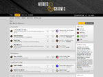
Lol, I was just heading here to post my own quick mockup:

I basically did the same as @zombie.modernist with the logo and top banner, plus I got rid of a good deal of the orange in the main toolbar.

N+G.jpg

Also, I think the forum needs to define 1 or 2 fonts to give it a distinctive look, because it looks to me like the one we have now is the standard one from the default template.
Again, I'm not trying to be an a-hole, I'm just voicing my opinion and offering my help in case the community and staff wants it (: I just want our new home to look sexy AF
 
Lol, I was just heading here to post my own quick mockup:

I basically did the same as @zombie.modernist with the logo and top banner, plus I got rid of a good deal of the orange in the main toolbar.

View attachment 1254

Also, I think the forum needs to define 1 or 2 fonts to give it a distinctive look, because it looks to me like the one we have now is the standard one from the default template.
Again, I'm not trying to be an a-hole, I'm just voicing my opinion and offering my help in case the community and staff wants it :) I just want our new home to look sexy AF
1257

gif, not work for me
 
Back
Top