You are using an out of date browser. It may not display this or other websites correctly.
You should upgrade or use an alternative browser.
You should upgrade or use an alternative browser.
September 2020 Challenge Thread- The Gav-La’s
- Thread starter Gavaxeman
- Start date
BjorgenFjorgen
Well-Known Member
RowBearToe
Well-Known Member
Day 27: “Labels”- picture those immortal circular label designs
Run the Jewels - Run the Jewels 2
I love the simplicity, but also the awesomeness of these lables. It was a mistake for me to take this picture without including the middle finger for side 1 haha
Run the Jewels - Run the Jewels 2
I love the simplicity, but also the awesomeness of these lables. It was a mistake for me to take this picture without including the middle finger for side 1 haha
BjorgenFjorgen
Well-Known Member
ranbalam
Well-Known Member
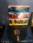
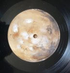
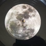
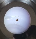
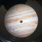
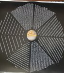
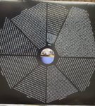
Day 27 - Labels
Modest Mouse - Strangers to Ourselves
Cool idea for the labels, with the key on the jackets.
Drum note
I love Jeremiah Green's drumming. I'd say he's the epitome of a musical drummer. He adds so much to the MM catalog with the choices me makes; his beats and fills are nearly always exactly what the song needs. I truly think he elevates Brock's writing.


Last edited:
tvham
Well-Known Member
howmuchartcanyoutake
Active Member
Wicked Dreamer
Well-Known Member
Selaws
Well-Known Member
Day 27: “Labels”- picture those immortal circular label designs
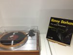
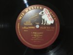
Kenny Dorham And The Jazz Prophets - S/T (His Masters Voice, 1957 First UK Sample/Promo 10" Pressing)
Decided to use todays challenge to highlight the legend that is....Nipper the dog. Nipper was from Bristol and gained his name from his habit of nipping on the back of peoples legs. He posed with the gramophone for the legendary painting which eventually became the logo for His Masters Voice (it still is, but in a more stylised version). Interestingly, Nipper's final resting place is a town I frequent (its where my local record store is), Kingston. He even has a street named after him, Nipper Street. This copy of Kenny Dorham And The Jazz Prophets is on the HMV label and was a promo/sample copy from the estate of Tony Hall.


Gavaxeman
Well-Known Member
Day 27: “Labels”- picture those immortal circular label designs
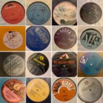
So I’m a big Smiths/Morrissey fan - one of the things I love was/is the attention to sleeves and label design - and although Morrissey is choosing some odd covers these days - he’s got a great knack of reactivating old label designs of years gone by throughout his solo career - so here’s 16 of them for you - spanning 1988 to 2020
So I’m a big Smiths/Morrissey fan - one of the things I love was/is the attention to sleeves and label design - and although Morrissey is choosing some odd covers these days - he’s got a great knack of reactivating old label designs of years gone by throughout his solo career - so here’s 16 of them for you - spanning 1988 to 2020

sahomerrocks
Well-Known Member
TenderLovingKiller®
Well-Known Member
LeSamourai
Well-Known Member
Day 27: “Labels”- picture those immortal circular label designs
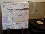
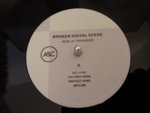
Broken Social Scene - Hug of Thunder
I don't ask much of my labels- in fact, the main thing I want is to be able to QUICKLY AND EASILY see which side is A or B, disc 1 or 2, etc... without having to squint at the etching or anything. This album delivers that, so the label is a win.
Broken Social Scene - Hug of Thunder
I don't ask much of my labels- in fact, the main thing I want is to be able to QUICKLY AND EASILY see which side is A or B, disc 1 or 2, etc... without having to squint at the etching or anything. This album delivers that, so the label is a win.


TenderLovingKiller®
Well-Known Member
Day 27: “Labels”- picture those immortal circular label designs
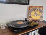
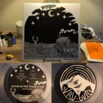
Grateful Dead - Wake Of The Flood
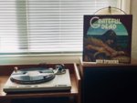
I love label art and secretly dream of being a graphic designer. I tend to favor a design that show of the actual record label (Capital, RCA, Blue Note, Mainstream, etc..) to labels that are more an extension of the albums art design but there are exceptions. My least favorite labels That slap their own label on what would be a nice reproduction.
Here is my best attempt at photographing one of my favorite labels. unfortunately I’m no @LeeVing (seriously, I appreciate your ongoing documentation of album labels It’s always a super interesting component of your “what’s spinning” posts).
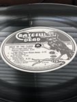
This label was their first for their newly created independent label, Grateful Dead Records; after leaving Warner Brothers. The “Grateful Dead” font is fantastic and that crow clasping the turntable spindle is tons of fun!
Grateful Dead - Wake Of The Flood

I love label art and secretly dream of being a graphic designer. I tend to favor a design that show of the actual record label (Capital, RCA, Blue Note, Mainstream, etc..) to labels that are more an extension of the albums art design but there are exceptions. My least favorite labels That slap their own label on what would be a nice reproduction.
Here is my best attempt at photographing one of my favorite labels. unfortunately I’m no @LeeVing (seriously, I appreciate your ongoing documentation of album labels It’s always a super interesting component of your “what’s spinning” posts).

This label was their first for their newly created independent label, Grateful Dead Records; after leaving Warner Brothers. The “Grateful Dead” font is fantastic and that crow clasping the turntable spindle is tons of fun!
Last edited:
