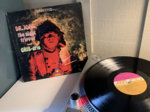
I'm just about to start my second spin... this is my first time listening to it.
This has been one of those records that has always been on my radar. I remember first encountering it when I was sixteen and flipping through Rolling Stone's first crack at their 500 Greatest Albums of All Time list. Like most people who had a copy of that issue, there was a scramble on my part to tally up what I had heard, what I owned, and what I needed to buy (all CDs, of course. In fact, I remember my copy of the magazine came with an SACD sample disc).
I never scooped this one up. I honestly think a lot of my decision had to do with the album artwork. Like any good sixteen year old, I was into the Smiths and other melancholic-new-wave-new-romancer-is-communism-a-good-idea?-type music. Indeed, late-60s smoky psychedelic projections complete with bubble letter font didn't seem to visually appeal to me, so there was no way in hell I'd like whatever was on the disc.
That was half my life ago, and I'm pleased to say I'm (slightly) more open-minded now. The album is solid, but the artwork is still debatable to me. I don't think it aligns with the music at all.
Yeah, yeah, yeah don't judge a book by its cover, I know. However, I find artwork to be especially important to the listening experience. I want the artwork to tell me what I'm about to hear. And before you jump all over me for this, let me remind you that you're probably the same. I can almost guarantee that being able to hold the album artwork in your hands is one of the reasons you buy vinyl in the first place. Artwork is important.
So what do you think, folks? Is the artwork any good? Is there a difference between "good" and "iconic" artwork? Do you think it matches up with the music? If not, what would you change?
Hmmm…
