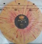
This kind of stuff really gets me as a designer and record collector. This was designed for a 5" CD jewel case in 1996, and likely composed in a raster program like Photoshop, so tied to that resolution. Without access to the original file (which wouldn't help much either) you're forced to do a 2.5x upscale or just rebuild the composition with the underlying image as a base. I remembered the Get on Down issue of this looking fine when I saw it in a shop, so I checked it out on Discogs compared to the OG CD copy.
This is the CD, and
this is the Get On Down pressing. Get On Down has taken the path that a lot of audiophile labels due with reissuing old albums, to completely rebuild the artwork. Despite looking close to a casual viewer, their typeface actually isn't a match to the CD's, but honestly I think it looks pretty good, and is preferable to such a massive upscale of artwork composed for a CD. It is odd to me that VMP chooses to recompose ROTM artwork frequently but didn't rebuild this cover. I guess this is less revisionist, if less pleasing to the eye.
Anyhow curious how it sounds, especially in comparison to the CD or Get on Down pressing. Mine should be coming this month.

