Jazz

A guy made a video about this last year. Inconssistent use of catalogue numbers on the spines for the AS Impulse series


Tone poets too. As someone who works in graphic design and works with graphic designers a lot, it’s pretty frustrating how little attention to detail there is a lot of the time.
 
A guy made a video about this last year. Inconssistent use of catalogue numbers on the spines for the AS Impulse series


Tone poets too. As someone who works in graphic design and works with graphic designers a lot, it’s pretty frustrating how little attention to detail there is a lot of the time.
I wouldn't say it infuriates me, but it is annoying how the artist, title, catalogue number, logo, etc doesn't line up on the spine. It should be a standard template that they use for each release, it really isn't that difficult.

I'm not a graphic designer but it does play a huge part in my job as an Architect and the use of a template to ensure pages, drawing packs, etc are consistent is such a basic part of what we do. The whole point of a template is to make sure things are consistent and allow any number of people to work on a different title whilst maintaining consistency. I bet professional graphic designers would pull their hair out seeing this .

Hell, with Cornbread they even used a different font style for the title.

IMG_6103.jpg
 
Tone poets too. As someone who works in graphic design and works with graphic designers a lot, it’s pretty frustrating how little attention to detail there is a lot of the time.
The problem is that at record labels there is pretty much no one left to do this kind of proofing work, and no one knowledgeable about the subject anyways.

At record labels today, there are two main categories of employees - lawyers and the streaming team, whose goal is to pump up Spotify streams by manipulating playlists.

The vinyl is in most cases one or two people. At Acoustic Sounds, it is probably no one, as they rely on the originating label.
 
As just a straight up bargain original (57 re-release from '51, RVG cut) that you can still get for a cost effective, NM price, let me present for your consideration:

Dizzy Gillespie · Milt Jackson · Joe Carroll - School Days

Url: Dizzy Gillespie · Milt Jackson · Joe Carroll - School Days

Description from All music -- it's a hell of cast:

An old recording from 1951, this album has been re-released on Columbia from the old Savoy/Regent recordings. The blowing is insane in spots -- in "Pop's Confessin," Dizzy tries to hit the loudest, highest, longest note possible (à la Roy Eldridge). Joe Carroll provides some humor in his vocal work (often performing in duet with Dizzy). Milt Jackson actually goes without his vibes here, singing and playing piano. A young John Coltrane solos on “We Love to Boogie,” which was one of his first appearances on record. According to the original liner notes, other performers on the album are "probably" Bill Graham on baritone sax, Wynton Kelly on piano, Percy Heath on bass, and Al Jones, Kansas Fields, or Joe Hanes on drums. The interplay among trumpet, piano, and Joe Carroll's vocals is some of the best you'll hear from this time period (it gets even better in a couple years, but this is still outstanding). "Lady Be Good" is a tour de force for Carroll, and "School Days" starts to sound a lot like the blues-shouting R&B of the day. For any fan of Dizzy, and the bop of the day, this is a worthwhile investment in listening pleasure. The trumpet is good, the vocals are good, the humor is good. You can barely miss with this one.

My comments: it's a gem. Yes, there are vocals -- I'd still encourage taking a spin -- the playing is unreal, and the sound of joy in the band is amazing
 
I wouldn't say it infuriates me, but it is annoying how the artist, title, catalogue number, logo, etc doesn't line up on the spine. It should be a standard template that they use for each release, it really isn't that difficult.

I'm not a graphic designer but it does play a huge part in my job as an Architect and the use of a template to ensure pages, drawing packs, etc are consistent is such a basic part of what we do. The whole point of a template is to make sure things are consistent and allow any number of people to work on a different title whilst maintaining consistency. I bet professional graphic designers would pull their hair out seeing this .

Hell, with Cornbread they even used a different font style for the title.

View attachment 132071
The most frustrating part is the template exists already haha. It’s not like they have to design these things from scratch. Especially in the case of Impulse! The hard work has already been done.

The only label I have separated out in my shelves are the MoFis. Noticed the other day that they changed the spines on the One Step album jackets now too. The category number is on the spine now for Tapestry but none of the others have it.
 
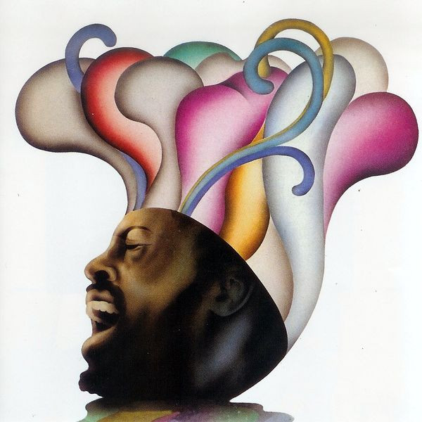
I'll add this as well, Leon Thomas

The '73 Pressing is great and the sonics drift into demo quality. I picked up a NM for around ~$50. The record is a tour. In almost every summary of Lemon Thomas some reviewer says: "I don't know how he wasn't bigger" -- they aren't wrong

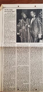
Edit: the seller was kind enough to include this 1970, Dec 24, Rolling Stone article
20220312_124720.jpg
 
Last edited:
I'll add this as well, Leon Thomas

The '73 Pressing is great and the sonics drift into demo quality. I picked up a NM for around ~$50. The record is a tour. In almost every summary of Lemon Thomas some reviewer says: "I don't know how he wasn't bigger" -- they aren't wrong

Edit: the seller was kind enough to include this 1970, Dec 24, Rolling Stone article
View attachment 132081
Gotta check this one out. I picked up The Leon Thomas Album a few years ago. Wish Flying Dutchman had a better reissue series
 
Well, if it’s Grundman mastered, then I have to retract my comment bc I have this KG/SH version that someone on N&G (probably MikeH) posted a link to sometime last year. Not saying the Grundman doesn’t sound as good or better bc I can’t say anything about it! Then again, I also can’t find a Grundman mastered Sax. Colossus on Discogs, so maybe there’s a mistake somewhere?
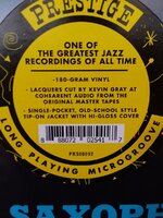
My Colossus came today. KG/AAA Hype confirmed, Amazing $22 at Plaidroom! (thank you Bob!)
20220312_135904.jpg


@MikeH @Plaid Room / Colemine
 
Ugh - I picked one up from RecordMule via Cogs this week and it had a gouge in Side2/Track1 (not their fault). Unfortunately, they have no other copies in stock.

Is this the one you grabbed at Plaidroom: Sonny Rollins - Saxophone Colossus [180g] [LIMIT 1 PER CUSTOMER]
yep, but I saved $3 and went with the damaged, which just has some wrinkled shrink wrap from what I see
 
@Selaws You might be interested in this one


One hell of an album, thanks for sharing! I would definitely be interested but I'm fortunate enough to have the original pressing.

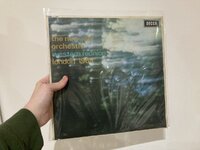
The New Jazz Orchestra were really important to the British jazz scene and in many of the books/biographies I have read it gets a mention for being so influential. This album is their debut (of 2 releases) and I believe it was recorded in front of a small select audience. The compositions are almost all standards which they approach really nicely, drifting into modal jazz, but it would have been more interesting if they were to have included some of their own compositions. When you consider the group includes the likes of Neil Ardley, Ian Carr, Jon Hiseman, Barbara Thompson, etc, there were plenty of opportunities for them to showcase some British writing and arrangements.

The next step up from this is their follow-up and final album, "Le Déjeuner Sur L'Herbe", which was recently reissued as part of the Decca British Jazz Explosion series (Link here -don't know why its the US site). It's a much more interesting album in my opinion for the fact that it includes compositions from Mike Taylor, Michael Gibbs, Michael Garrick, and Neil Ardley. On a depressing side note, Taylor committed suicide before this was released. He was mentally unstable anyway but part of this was his longing to be recognised, had he not committed suicide this album would have been the start of his fame building. Anyway, Le Déjeuner Sur L'Herbe really is killer and worth looking into as well if you haven't already. I can't speak of the pressing quality of the new reissue (I'm fortunate enough to have the first pressing) but I have heard great things.

Sorry for the rant, it's just such a fantastic group!

IMG_6160.JPGIMG_6161.JPG
 
Back
Top